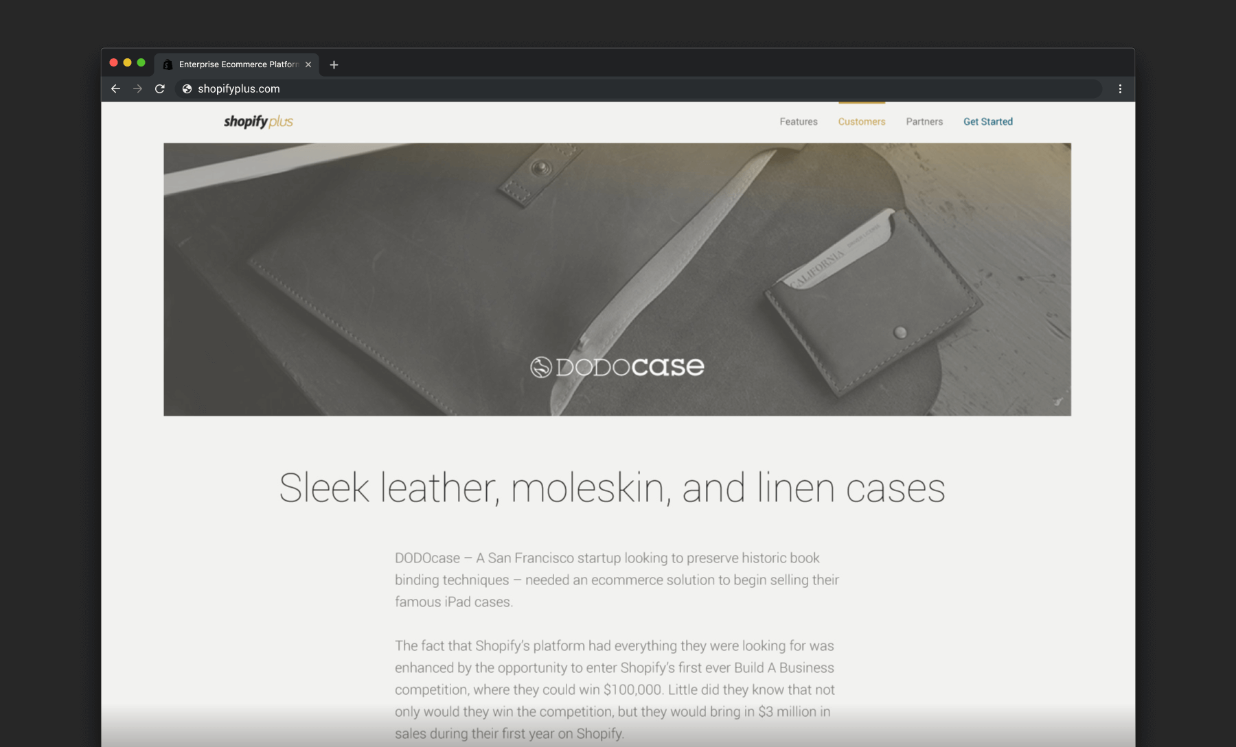
After its first year in business, the Shopify Plus team learned a lot about their customers and who they were. It was clear their website didn’t accurately represent them anymore and so they decided it was time for a redesign. I was picked to lead the project and saw it from concept through to delivery — even coding parts of it.
We collected both qualitative and quantitative data to measure the effectiveness of the new design after it launched. It was successful not only based on how our customers perceived us but also by the number, and quality, of leads we were collecting. When it was all said and done, I wrote an article for Invision’s blog and shared the following design tools and process I used for the redesign:
Project brief
The very first thing I did when I started this project was to write up a project brief so I could keep everyone on the same page. I made sure to update it as we went along so that it always reflected the latest state of the project. It served as a great tool to communicate the goals of the project and onboard new team members onto the project.
These were some questions I included:
- What are we trying to achieve?
- How will we know the project is a success?
- What do we need to do?
- Why do we need to do it?
- What are the must-haves?
- Who are we doing this for?
- How will they know about it?
- Who’s on the project team?
- What’s our deadline?
Stakeholder interviews
At the very beginning of the project, I kicked things off by running 1-on-1 interviews with members of our executive team and some of our top customers to learn from them what Shopify Plus is all about. I recorded each interview so I could pay full attention and took notes later when I listened the recordings over again. The notes allowed me to capture the key points which highlighted patterns and themes which we used to guide the direction of the new design.
I remember how inspired I felt after my first round of executive interviews — it was like I knew everything there was to know about the product. After that, writing vision and mission statements, brand guidelines, project briefs, and the websites copy came easy. As we progressed through the project, we would continue to check in with different customers and test the design to make improvements.
Competitive analysis
Early in the project, I reviewed the the competitive landscape to see how other people were speaking to our customers. I started with a list of direct competitors, then moved on to businesses that serve our target audience outside the ecommerce field.
The analysis highlighted common patterns appearing on multiple sites which echoed what our customers were looking for in our interviews with them. One of the common patterns we noticed was how busy, and confusing, a lot of these enterprise sites were. We honed in on that fact and used clarity and simplicity as a key principle to set ourselves apart.
Information architecture
Early in my web design career, I learned to draw information architecture (IA) diagrams as a way to document an existing system or express a new one. Early in the process, I drew a diagram of our old site that showed the hierarchy and relationships of screens.
Through that process, I evaluated the content and the traffic to the screens to find lots of orphans or deeply linked pages. I used the information I gathered to create a new IA and suggested changes. The diagram was a great tool that helped us have important discussions around defining the scope of our project releases and acted like a checklist as we wrote, designed, and coded all the pages.

Wireframes
I used wireframes throughout the redesign to help think through problems, and get approval for ideas. Some were sketched on napkins and shared face-to-face, and others were drafted and shared online.
An unexpected bonus for me was discovering how much easier it was to write copy directly in the wireframe rather than in a document. Seeing the copy visually was helpful for me to create a through line for each screen and across the pages for a nice coherent narrative.

Inspiration boards
My inspiration boards allowed me to share my vision of what our new brand might look like and helped me get early buy in from the team.
I developed my concepts in Adobe Illustrator by combining words, images, and colour swatches into something that looked like an ad. The same elements appeared in all the boards I created, but their placement and appearance changed from board to board.


Prototypes
Back in my consulting days, I found people didn’t quite pay attention to wireframes or web designs if they were printed on paper. Showing them a design on a screen was better but the thing I have found that worked the best, to captured people’s attention, was sharing something interactive.
I started developing interactive mockups early in the wireframing process. We shared them with our customers and the team throughout the project until most of the site was coded. We had people speak out their thoughts as they browsed through the prototype. Their feedback highlighted problem areas and validated design choices which helped us shape the end result into something successful for both us and our customers.

End result


